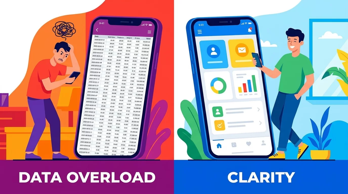
As a developer, you know the feeling. You build a massive, data-rich backend for a custom CMS or a multi-branch school management system. It looks beautiful on your ultra-wide desktop monitor. Then, you open it on your phone, and it is a complete disaster.
The rows stretch off the screen. The text is impossible to read. The browser freezes just trying to scroll. If you want to optimize admin dashboard tables for mobile speed, you need more than just a quick CSS fix. You need a structural change in how data is presented and loaded.
Mobile traffic makes up a huge portion of internet use today. Even business owners checking their Point of Sale (POS) inventory or reviewing daily revenue do it from their phones. If your admin dashboard is slow, your users will be frustrated.
In this guide, you will learn exactly how to transform heavy, lagging data grids into lightning-fast mobile experiences. We will break down everything from UI optimization to deep web performance tweaks. By the end, you will have a clear, step-by-step roadmap to make your data tables fast, responsive, and incredibly user-friendly on any device.
Why Massive Tables Break on Small Screens
Before we can fix the problem, we need to understand why data tables fail so badly on smartphones. The issue usually comes down to two things: visual clutter and browser overload.
When you have a table with 15 columns of data, it physically cannot fit on a screen that is only a few inches wide. The traditional HTML table structure forces the browser to calculate the width of every row and column before it renders the content.
If you have thousands of rows of student records or e-commerce orders, this calculation takes time. The browser has to work extremely hard, which drains the phone's battery and causes the screen to freeze.

The DOM Tree Overload
Every single piece of data in a table creates an element in the Document Object Model (DOM). A simple table with 100 rows and 10 columns creates over 1,000 DOM nodes.
Mobile processors are powerful, but they are not magic. When you force a mobile browser to render thousands of nodes at once, the web performance drops dramatically. Scrolling becomes jerky. Buttons take too long to tap.
The Fat Finger Problem
Even if the table loads quickly, it might be impossible to use. When rows are squeezed tightly together to save space, the buttons inside those rows become too small.
If a user tries to tap "Edit" but accidentally taps "Delete" because the buttons are crammed together, you have failed at mobile design. True mobile-first design means respecting how people physically interact with their touchscreens.
Core Strategies for Mobile-First Tables
To fix these issues, we have to rethink the table entirely. You cannot just shrink text and hope for the best. You need a targeted approach to UI optimization.
The Card View Transformation
The single most effective way to optimize admin dashboard tables on mobile is to stop using tables altogether on small screens. Instead, transform your rows into cards.
In a desktop view, data flows left to right. In a card view on mobile, data flows top to bottom. Each row of your table becomes a single, self-contained box.
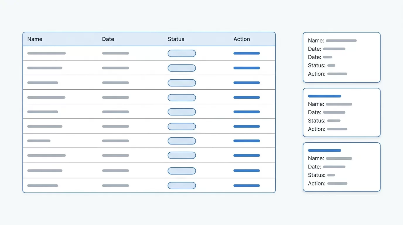
For example, imagine an inventory list for a dropshipping store. On desktop, the columns might be: Product Name, SKU, Stock Level, Price, and Actions.
On mobile, this becomes a card:
-
Product Name (Large, bold text at the top)
-
SKU: 12345 (Smaller text below)
-
Stock: 50 Units (Highlighted in green)
-
Price: $19.99
-
Action Buttons: Placed at the bottom of the card for easy tapping.
This layout is infinitely easier to read on a phone. It completely removes the need for horizontal scrolling and gives you plenty of space to make text readable.
Horizontal Scrolling with Sticky Columns
Sometimes, converting to cards is not an option. If your users need to compare data side-by-side (like financial metrics or detailed analytics), a card view might hide too much context.
In this case, the best solution is a horizontal scroll with a sticky first column.
Here is how it works:
-
Wrap your table in a container with
overflow-x: auto. -
Make the first column (usually the identifier, like a Name or Order ID) sticky using CSS (
position: sticky; left: 0;). -
As the user scrolls right to see the rest of the data, the main identifier stays locked on the left side of the screen.
This keeps the context clear. The user never has to guess which row of data they are looking at, even if they have scrolled past ten different columns.
Priority Columns: Hiding the Fluff
Not all data is created equal. If you must use a traditional table layout on smaller tablets or large phones, you need to decide which columns are truly important.
Implement a system that hides low-priority columns as the screen gets smaller.
-
Desktop: Shows all 10 columns.
-
Tablet: Hides the "Created Date" and "Last Login" columns.
-
Mobile: Shows only the "Name", "Status", and an "Expand" button.
When the user taps the "Expand" button, a small dropdown or modal opens to reveal the hidden data for that specific row. This keeps the initial view clean and incredibly fast to load.
Boosting Web Performance Under the Hood
Changing the layout is only half the battle. If your backend is sending too much data, your dashboard will still be slow. Whether you are using React, PHP, or Python, your data delivery must be efficient.
Implementing Lazy Loading
Never load 1,000 records at once on a mobile device. It is a massive waste of bandwidth and processing power.
Instead, use lazy loading. Only load the first 20 or 30 records. As the user scrolls near the bottom of the list, automatically fetch the next batch of records from the database.
This drastically reduces the initial load time. It also saves data for mobile users who might not be on a fast Wi-Fi connection.
Debouncing Search and Filters
Admin dashboards rely heavily on search bars and filters. If your search bar sends a request to the server for every single letter the user types, it will crash the mobile browser.
Imagine typing "John" into a search bar.
-
J (Sends request)
-
o (Sends request)
-
h (Sends request)
-
n (Sends request)
This is terrible for web performance. Instead, use a technique called "debouncing." This forces the browser to wait until the user stops typing for a fraction of a second (usually 300 milliseconds) before sending the request.
This simple change can make a massive dashboard feel lightweight and highly responsive.
Minimizing Heavy Libraries
Many developers rely on heavy JavaScript libraries to build their tables. While these tools offer great features, they come with a massive file size.
If you are optimizing for mobile, ask yourself if you really need a massive 500kb library just to display some rows of data. Often, custom HTML, lightweight CSS, and a few lines of vanilla JavaScript will perform much faster.
Pro Tips for Lightning-Fast Data Grids
To truly master mobile UI optimization, you need to pay attention to the smallest details. Here are professional tips that separate average dashboards from exceptional ones.
Optimize Touch Targets: Apple and Google both recommend that interactive elements be at least 44x44 pixels. If your table rows have small "Edit" or "Delete" icons, increase their padding. Make sure there is enough space between icons so users do not make accidental taps.
Use CSS Grid over HTML Tables for Cards: If you are converting rows to cards, use CSS Grid. It is incredibly efficient and allows you to rearrange data points easily based on screen size without rewriting your HTML structure.
Avoid Complex CSS Shadows and Gradients: When a mobile phone has to render hundreds of boxes, complex box-shadows and CSS gradients can cause "jank" (stuttering) during scrolling. Stick to flat colors and simple borders to keep the frame rate high and smooth.
Pre-format Data on the Server: Do not force the mobile device to format dates or calculate totals. If you are using a Python or PHP backend, do the heavy math there. Send the exact, formatted string (like "$1,250.00" or "May 12, 2026") directly to the frontend. The less thinking the mobile phone has to do, the faster the page will load.
Common Mistakes to Avoid
Even experienced developers make critical errors when trying to optimize admin dashboard tables. Avoid these common traps to ensure your project succeeds.
Mistake 1: Relying Only on Zooming Some developers simply shrink the table and expect users to pinch and zoom to read the data. This is a terrible user experience. It forces the user to drag the screen in all directions just to read a single sentence. Never force your users to zoom.
Mistake 2: Using the Wrong Input Keyboards If you have a table where users can edit data inline, make sure you trigger the correct mobile keyboard. If a field requires a phone number, the HTML input type should be tel so the user sees the large number pad, not the standard alphabet keyboard.
Mistake 3: Forgetting Empty States What happens if the table has no data? On mobile, a blank screen looks like a broken app. Always design a friendly "Empty State" with a clear message like "No orders found" and a button to refresh or create a new entry.
Mistake 4: Overusing Modals on Mobile Pop-up modals work great on desktop, but they can be a nightmare on mobile. They often trap the user, break scrolling, or are impossible to close. If a user clicks a table row for more details, slide them to a new page instead of stacking a modal on top of the screen.
Advanced Strategy: Virtualization and Server-Side Pagination
If you want to go beyond the basics, you have to look at how enterprise-level applications handle massive datasets. If you are building a system that tracks millions of records, simple lazy loading is not enough. You need DOM Virtualization.
What is DOM Virtualization?
Imagine you have a list of 10,000 items. Even if you lazy load them, as the user scrolls down, those nodes stay in the browser's memory. By the time they reach item 2,000, the phone's memory is full, and the app crashes.
Virtualization solves this. It is a technique where the browser only renders the items that are currently visible on the screen, plus a few above and below for a buffer.
If your screen can only fit 5 cards at a time, virtualization ensures that only 7 to 10 DOM elements exist at any given moment. As you scroll down, the items that disappear at the top are instantly recycled and moved to the bottom with new data.
This means a list of 10,000 items uses the exact same amount of phone memory as a list of 10 items. The scrolling remains perfectly smooth at 60 frames per second, no matter how large the database gets.
Coupling with Server-Side Pagination
Virtualization on the frontend must be paired with strict server-side pagination on the backend.
Your database should never run a generic SELECT * FROM table command for an admin dashboard. Queries must be strictly paginated using limits and offsets. Furthermore, use indexes on your database columns that are frequently sorted or searched.
By combining highly indexed server-side pagination with frontend DOM virtualization, you create an unbreakable architecture. The mobile UI will remain lightning-fast, and the server will experience a significantly lower load. This is the gold standard for long-term scalability.
Conclusion
Building complex backend interfaces is challenging, but making them work beautifully on small screens is an art.
To properly optimize admin dashboard tables, you have to change your mindset. You cannot just force a massive desktop layout onto a tiny screen. You must embrace mobile-first design principles. Transform complex rows into easy-to-read cards. Use sticky columns when horizontal scrolling is absolutely necessary. Hide non-essential data to protect the user's attention.
Beyond the visuals, never forget the engine running underneath. Protect the device's memory by limiting DOM nodes, utilizing lazy loading, and processing heavy calculations on your server.
When you prioritize web performance and clean design, you build tools that people actually enjoy using. Your clients will spend less time fighting with the interface and more time growing their business. Stop letting heavy data slow your applications down. Start applying these optimization techniques today, and watch your mobile dashboard speeds skyrocket.
FAQs
What is the best way to show a massive data table on a phone? The best method is to stop using a traditional table format entirely. Convert the rows of data into stacked "cards" where information flows vertically. This removes horizontal scrolling and makes the text much larger and easier to read. If cards won't work, use a horizontal scroll container with a sticky first column to keep context clear.
Why does my admin dashboard lag on mobile devices? Lag is usually caused by having too many elements in the DOM (Document Object Model). A table with hundreds of rows forces the mobile browser to calculate and render thousands of individual boxes at once. This drains the phone’s processing power. To fix this, implement lazy loading or virtualization to limit how much data is rendered at one time.
Is it okay to hide columns on mobile dashboards? Yes, hiding columns is a standard mobile-first practice. Identify the three or four most critical pieces of data and display only those on small screens. For the hidden data, provide an "Expand" button or a link to a detailed view page. This keeps the UI clean without permanently deleting important information.
How does lazy loading help web performance? Lazy loading improves performance by only fetching the data the user is currently looking at. Instead of downloading 1,000 records immediately, it downloads the first 20. When the user scrolls down, it fetches the next 20. This saves bandwidth, speeds up the initial page load, and prevents the browser from crashing.
Should I use JavaScript libraries for mobile tables? You should be very careful with heavy JS libraries. Many popular table plugins are built for desktop and contain massive amounts of code. This extra weight slows down mobile load times. For simple data grids, custom HTML and CSS with lightweight vanilla JavaScript will almost always result in a much faster mobile experience.
Read also Database Schema for Student Admission System Design Guide